Enemy Aliens

During the First and Second World Wars, foreign nationals residing in Australia were classed as “enemy aliens” if they came from countries warring with Australia.

Italian internees LovedayPhoto: H K Cullen ~ Italian internees Loveday Internment Camp 1943 ~ Colourised by Loredana Crupi

So when Italy declared war on Britain and its allies on 10th June 1940, Italian nationals living and working in Australia became hostages of war. In both World Wars civilians from enemy alien nations were arrested and incarcerated for the duration of the war in barbed wire compounds .

Loveday Camp in South Australia was the largest Commonwealth internment camp in the Southern Hemisphere and comprised of German, Japanese and Italian civilians who made up the largest group at almost 5,000. At its peak in 1942, more than 12,000 people were interned in Australia. Yet this episode in Australia’s wartime history remains relatively obscure.

Today’s image shows a group of Italian internees being relocated from No 9 Compound to 14D Compound at Loveday in 1943. The chap wearing a hat and a towel around his neck and carrying what appears to be a bird cage happens to be my father! He was incarcerated in 1941 for four years up until the end of the war. His crime? His birthplace.

A curious fact: the Australian government photographer was Hedley Keith Cullen, a part time actor who went on to become the ghoulish, late night, Australian TV host in South Australia and Perth during the 1960s and 1970s, better known as ‘Deadly Earnest’.

Meanwhile back in the USA …

Photo: Dorothea Lange – Grocery store in Oakland California 1942 ~ Colourised by Loredana Crupi

After the attack on Pearl Harbor, up to 120,000 Americans of Japanese descent were also classified as “enemy aliens”, and forcibly relocated to internment camps, euphemistically called “resettlement centers.”

Today’s image of a Californian grocery store was shot by Dorothea Lange, while working on assignment for the War Relocation Authority. It speaks volumes and even has the following lengthy title attributed to it.

“Oakland, Calif., Mar. 1942. A large sign reading “I am an American” placed in the window of a store at 13th and Franklin streets, on December 8, the day after Pearl Harbor. The store was closed following orders to persons of Japanese descent to evacuate from certain West Coast areas. The owner, a University of California graduate, will be housed with hundreds of evacuees in War Relocation Authority centers for the duration of the war.”

~~~~~~~~~~~~~~~~~~~~~~~~~~~~~~~~~~~~~~~~~~~~~~~~~~~~~~~~~~~~~~~

Original black and white photos.  Click on photos to enlarge.


Grocery Store 1943________________________________________________________________

“We make war that we may live in peace.”    –Aristotle

Posted in Australia, Australian Politics, Colorization, Colourisation, History, Opus Loredana, Photography, USA, World War 2 | Tagged , , , , , , , , | 1 Comment

“Beauty is in The Eye of The Gazer.” ― Charlotte Brontë

Gertrude Stein once said,

“I have always noticed that in portraits of really great writers the mouth is always firmly closed.”

Certainly that is the case with today’s subject, Charlotte Brontë.  There’s a good reason for this. We know from personal letters that she had very bad teeth. In fact one of the first things English novelist, Elizabeth Gaskell noticed about poor Charlotte was her teeth. In her posthumous biography, The Life of Charlotte Brontë (1857), Gaskell writes a less than flattering description of Charlotte saying she had “a reddish face, large mouth and many teeth gone; altogether plain, the forehead square, broad and rather overhanging.”

Ouch!  Was that really necessary, Mrs Gaskell?

Charlotte Bronte Colourised

Charlotte Brontë 1850 ~ Original chalk drawing by George Richmond ~ Colourised by Loredana Crupi

If only we had photos. It cannot be said with any certainty that any photos of Charlotte, and her famous literary sisters Emily and Anne Brontë exist.

A sad fact because they lived at a time when photography, though in its infancy could have made it possible.  Although evidence exists that Charlotte, the eldest of the trio refused an invitation to sit for a daguerreotype portrait, there is much speculation about the existence of several photos purporting to be of the Brontë sisters.   It seems any photo with a group of three women appropriately attired taken around the middle 1800’s is a likely contender for a portrait of the famous siblings.  Certainly much has been written about them in this regard, which with a little scholarly Google research you can go and appease your curiosity.

As much as would like to know what they looked like, we have only sketches to go by. So as an exercise to appease my own curiosity, I thought it would be interesting to see how one of these esteemed sisters might look if I applied a little digital life into a sketch of Charlotte.

Drawn by the renowned English portraitist, George Richmond* in 1850, it was commissioned by Charlotte’s publisher, George Smith as a gift for her father, who upon receiving it recognised ‘strong indications of the genius of the author.’  There is some conjecture around whether Richmond may have idealised her portrait, so we will never really know exactly how she looked but I do like this drawing of her and tend to agree with her father.  Charlotte was 34 when she sat for this portrait and was at the peak of her success with Jane Eyre, her best known novel and a classic of English literature.

According to George Smith, when the portrait was completed Charlotte burst into tears because it bared a strong resemblance to her late sister Anne, who died of tuberculosis several months earlier aged only 29. (The same fate had befallen their sister Emily the year before in 1848.)

Five years later, Charlotte died just three weeks before her 39th birthday. Her death certificate gives the cause of death as tuberculosis.

I think, Charlotte would have approved of the colourisation…not so sure about George Richmond 🙂

*George Richmond produced more than 3,000 portraits during his lifetime, including  those of Charles Darwin, Elizabeth Fry, Edward VII,  William Blake, and John Ruskin.

_____________________________________________________________

“I am no bird; and no net ensnares me: I am a free human being with an independent will.”

― Charlotte Brontë, Jane Eyre

Posted in Art, Britain, Colorization, Colourisation, Literature, Opus Loredana, United Kingdom, Women, Women in Literature, Women writers | Tagged , , , , , , , , , , , , , | 1 Comment

Giacomo Puccini – Life Imitating Art

Time for a reprise of an earlier post as I am reminded today of the great Italian musician, Giacomo Puccini, whose colourisation I have also revised.

It was only 91 years ago on this day, that the curtain came down on one of Italy’s most famous sons. Heralded as one of the greatest operatic composers of the 19th century, Puccini’s personal life mirrored much of the drama of his melodramatic operas. A tumultuous life…was it a detriment to, or an inspiration for his music? You be the judge.

His popularity has not waned over the last nine decades as his music continues to be performed in the great opera houses of the world to the delight of millions of fans.

Read on to see what all the drama was about…

Random Phoughts

Day 206 of Colourisation Project – November 29

Challenge: to publish daily a colourised photo that has some significance around the day of publication.

If there is any doubt as to whether life imitates art, you need delve no further than into the life of Italian composer, Giacomo Puccini.  Love, infidelity, jealousy, vengeance and death, – all staples of Puccini’s operas; but they were also the ingredients to another more palpable drama being played out in real life.

Puccini Bef & Aft 
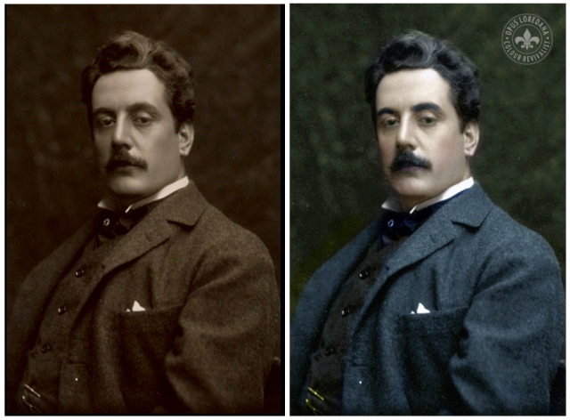
Photo: Studio Bertieri – Giacomo Puccini – Colourised by Loredana Crupi

Giacomo Puccini is the most commercially successful opera composer there has ever been. His genius lay in his ability to write beautiful melodies that audiences responded to. Often ranked as one of the greatest exponents of operatic realism, Puccini’s operas include the ever popular, La Bohème (1896), Tosca (1900), and Madama Butterfly (1904). These operas are his most frequently performed…

View original post 820 more words

Posted in Opera, Opus Loredana, Uncategorized | Tagged , , | Leave a comment

Flinders St Station – Melbourne Icon

Melbourne’s iconic Flinders St Station is the one thing that has remained consistent in my lifetime of inhabiting this wonderful city and when I found this old black and white image in reasonably good condition, I naturally got the urge to colourise it.

Flinders-street-station

Photographer Unknown ~ Flinders St Station ~ Melbourne  –  Colourised by Loredana Cupi

A quick Google search of Flinders St will show that this architectural masterpiece has not changed in over 100 years, at least not outwardly.

Flinders St Station

Flinders St Station Flinders St today – Photographer – JWC Adam

Designed in 1899 and completed by 1910, it sits smack in the heart of the city of Melbourne. It was Australia’s first railway station in any major city and it became the world’s busiest passenger station by the late 1920s. Just about every Melbournian has arranged to meet someone under those distinctive clocks showing the departure times of the next trains.

Listed on the Victorian Heritage Register, Flinders St Station was slated for demolition on many occasions. This grand old building of monumental importance in the history of Victoria was nearly replaced by Gas and Fuel Corporation of Victoria buildings in the early 1960s. That eye-sore, a set of twin office tower blocks, was eventually built on the current site of Federation Square but thankfully it was demolished 30 years later. Seriously, what were they thinking in the 1960s? So many outstanding examples of 19th century architecture were demolished to make way for nothing short of ugly towering city blocks.

Fortunately today, the Flinders St Station is set to receive a $100 million facelift including upgraded public toilets and repairs to the crumbling clock tower and leaky roof. Curiously though the renovation of the decaying ballroom on the third floor will not be upgraded. Perhaps in time it will be revived for it once was an integral part of the building.

For a more in-depth exploration of this majestic building head over to this wonderful and informative Flinders St website, where you can take a virtual tour of the station.

Posted in Architecture, Australia, Colorization, Colourisation, History | Tagged , , , , , , , , , , | Leave a comment

New Facebook Page

I have been a little absent lately, playing over on that other platform, Facebook, where I have connected in with a whole bunch of colourists who like to share their work. There is some pretty awesome work going around with groups dedicated to World War 1, World War 2 and so on.  So I have decided to join in the chorus by setting up an official FaceBook Page to do just that.

Opus Loredana

If you have enjoyed my colourisation posts, please feel free to ‘like’ my new Facebook Page, “Galleria Opus Loredana” by clicking on the widget on the right hand side of this page.

Posted in Colorization, Colourisation | Tagged , | 1 Comment

Look Closely

Looks can be deceptive. Photography can be deceptive. Or should I ask, “is seeing believing?”

Look closely what do you see? How many horses are there in this picture?

0174

Look Closely

If you said one horse, you’d be wrong. Look again. There are two horses in this picture. Yes, there are! Click on the photo to see an enlarged version. No, it’s not trick photography or clever editing. Synchronicity? Optical illusion? Being in the right place at the right time? A contrived photo set up? Definitely not. I kept my distance from these horses, just in case they weren’t too happy about a trigger happy photographer disturbing their equilibrium.  How these two beasts came to be in such perfect alignment I’m not sure. I’m just glad I was there to capture it.

And to prove it wasn’t a staged photo, here’s a photo of the same horses from a different angle taken several moments after the photo above.  Yes, seeing is believing…or is it?

0177
Posted in Australia, Photography | Tagged , , , , | 3 Comments

Look Down

IMG_0013

Photographers are often reminded to diversify their camera angles by looking upwards to capture imposing perspectives of buildings or majestic canopies of trees. Whilst this is essentially a terrific suggestion especially in Melbourne, where we have many architecturally beautiful and interesting buildings and gardens; (the remnants of a late 19th century ‘Marvellous Melbourne’ that managed to escape modern developers wrecking balls), I’m going to suggest doing the opposite for a change.

IMG_0016

Look what happens when you look down on a sunny day in Melbourne, more specifically in the northern suburb of Northcote, where there seems to be a proliferation of picket fences and small iron gates.

IMG_0029

IMG_0008

IMG_0006

Shadow is king! Often taken for granted, we more often than not, just don’t see them when we’re out and about.

IMG_0003

IMG_0018

IMG_0005

IMG_0032Shadow stained pavements.

IMG_0002

IMG_0004Shadow stained pavements

IMG_0010

IMG_0011

“If you don’t have any shadows, you’re not in the light”   –Lady Gaga

Posted in Australia, Black & White, Photography | Tagged , , , , , , , , , , | 9 Comments

The Mother of All Mothers

She “wanted it to be a holy day, a day of sentiment, not profit,”  dismissing greeting cards as “a poor excuse for the letter you are too lazy to write.”

First celebrated in 1908, when Anna Jarvis held a memorial for her own mother in Grafton, West Virginia, the celebration of Mother’s Day quickly became a movement. Jarvis chose a Sunday because she wanted it to be a “holy” day, not a holiday, and the second Sunday in May because it was the anniversary of her mother’s death.

Photograph Bettmann/Corbis ~Anna Jarvis c 1914 ~ Colourised by Loredana Crupi

Jarvis had campaigned for almost a decade to have a day set aside to honour all mothers. and in 1914, U.S. President Woodrow Wilson issued a proclamation calling for the observance of Mother’s Day. Other quickly countries soon followed suit,

Jarvis trademarked the phrases “second Sunday in May” and “Mother’s Day,” and created the Mother’s Day International Association. She was specific about the location of the apostrophe; it was to be a singular possessive, for each family to honour their mother, not a plural possessive commemorating all mothers in the world.

The mass commercialization of the day that followed was not part of Jarvis’s vision for the day. Greeting card companies and florists seized upon the glaring opportunity. The ‘holy day’ quickly became a retailing and marketing bonanza!

Jarvis was disheartened at the misinterpretation and exploitation of the day that she protested and even tried to rescind Mother’s Day. Her goal was to continue and honour the work of her mother, a peace activist and social worker, who as early as the 1850s, held ‘Mother’s Day’ work clubs to improve sanitary conditions and worked to lower the infant mortality rate by fighting disease and curbing milk contamination.  Jarvis’s also mother cared for wounded soldiers on both sides of the Civil War.

Whilst the symbol of the white carnation became entrenched in the celebrations across America, the flower traditionally given to mothers on this day in Australia is the humble chrysanthemum, as it is naturally in season during May (autumn in Australia) and some say because the name ends in “mum”, a common affectionate shortening of “mother”!

Jarvis spent her considerable inheritance and the rest of her life fighting the commercialization of “her” holiday but it was a losing battle.

Anna Jarvis died in 1948, at the age of 84, bitter, with dementia and completely penniless in a Philadelphia’s Marshall Square Sanitarium.

~~~~~~~~~~~~~~~~~~~~

Today I leave you with this wonderful tribute to Mother’s Day performed by a very young Ricky Martin and a not so old Luciano Pavarotti.

Enjoy and Happy Mother’s Day!

_____________________________________________________________

“A printed card means nothing except that you are too lazy to write to the woman who has done more for you than anyone in the world. And candy! You take a box to Mother—and then eat most of it yourself. A pretty sentiment.”

—Anna Jarvis

Posted in Colorization, Colourisation, History, Mother & Child, Opus Loredana, Photography, USA, Women | Tagged , , , , | 3 Comments

Gary Cooper ~ Style Icon

Day 365 of Colourisation Project – May 7

Challenge: to publish daily a colourised photo that has some significance around the day of publication.

Dressed up like a million-dollar trouper
Tryin’ hard to look like Gary Cooper, Super duper

                           —“Puttin’ on the Ritz,” Irving Berlin

Ralph Lauren, called him the “definitive” male style icon of the 1940s with “an ideal American look—unstudied yet refined, natural, and playful.”

Men’s fashion writer Bruce Boyer wrote that he had “his own debonair style that combined a perfectly tailored European wardrobe with all-American casual sportswear to produce the first, and still finest example of elegant, international, masculine style rooted in an American ideal of the everyman as hero.”

Photographer: Edward Steichen ~ Gary Cooper ~ Coloured by Loredana Crupi

They were talking about today’s colorisation subject, Hollywood leading actor, Gary Cooper, who looked great in whatever he was wearing. A timeless fashion icon with impeccable taste, he even brought a touch of style and glamour to American westerns.

Born on this day, May 7, 1901, Cooper was a major American film actor whose career spanned thirty-six years ranging from the silent movie era to the close of Hollywood’s classical golden age and from black and white to colour.

By box office figures, Cooper was the most popular male film star of the 1930s, 1940s, and 1950s and was ranked eleventh by the American Film Institute (AFI) on its list of the fifty greatest male screen legends. His understated acting style saw him receive five Academy Award nominations for Best Actor, winning twice, for Sergeant York (1941) and High Noon (1952). He also received an Academy Honorary Award for his career achievements in 1961.

Cooper appeared in over 100 movies, (20 of them being westerns) including classics such as A Farewell to Arms (1932), Sergeant York (1941),  The Pride of the Yankees (1943), For Whom the Bell Tolls (1944), The Fountainhead (1949), Love in the Afternoon (1957) and The Hanging Tree (1959).

Towards the end of his life Cooper was plagued with illness including prostate cancer. Within months the cancer had spread. This was announced to the world by his good friend, James Stewart at the Academy Awards when he accepted Cooper’s Academy Honorary Award on his behalf, as he was too sick to attend.  As Cooper lay dying of cancer, Pope John XXIII and Queen Elizabeth II sent get-well messages while President John F. Kennedy called him directly.

Gary Cooper eventually succumbed to lung cancer on May 13, 1961, six days after his 60th birthday. For fans still reeling from the death of Clark Gable six months earlier, it seemed that the curtain had come down on Hollywood’s Golden Era.

Cooper has a star on the Hollywood Walk of Fame at 6243 Hollywood Boulevard for his contribution to the film industry.

________________________________________________________________

“This is a terrible place to spend your life in. Nobody in Hollywood is normal. Absolutely nobody. And they have such a vicious attitude toward one another … They say much worse things about each other than outsiders say about them, and nobody has any real friends.”  –Gary Cooper

Posted in Colorization, Colourisation, Film, Hollywood, Photography, USA | Tagged , , , , , , , , , , , , , , , , | 9 Comments

Rudolph Valentino ~ Archetypal Latin Lover

Day 364 of Colourisation Project – May 6

Challenge: to publish daily a colourised photo that has some significance around the day of publication.

His birth name was Rodolfo Alfonso Raffaello Pierre Filibert Guglielmi di Valentina d’Antonguolla. 

Born this day, May 6, 1895, the Italian-born, American actor, better known as Rudolph Valentino, the quintessential Latin lover, the Ricky Martin of Hollywood’s silent movie era, was Hollywood’s first male sex symbol.

Rudolph Valentino

Photographer: Edward Steichen ~ Rudolph Valentino 1926 ~ Coloured by Loredana Crupi

In his brief career, he starred in over 30 silent films, including the ever popular The Four Horsemen of the Apocalypse (1921), The Sheik  (1921), Blood and Sand (1922), The Eagle (1925), and The Son of the Sheik (1926); films which firmly established his reputation as the archetypal latin screen lover.

A deeply exotic and alluring man, he was responsible for bringing the Argentine Tango to America, first performing it in on the big screen in 1921 and later in a successful American national dance tour with his second wife, Natacha Rambova, who, like Valentino himself, was once a professional dancer.

From the moment he danced that tango in The Four Horsemen of the Apocalypse (1921), one of the highest-grossing films of the silent era, a mania seemed to grow around him. Women reportedly fainted when they saw him in his next picture The Sheik (1921), a desert romance in which a Bedouin chief wins the heart of a cultured, English woman and again in Blood and Sand (1922), where as the bullfighter Juan Gallardo, he falls under the spell of a charming seductress.

Rumours have persisted since the 1920s about Valentino’s sexuality. However no evidence has surfaced to suggest he was anything other than heterosexual and any claims to the contrary have so far been disproved. Valentino fought a constant battle against innuendo about his masculinity. A few months before his death, an editorial in the Chicago Tribune attacked his masculinity, referring to him as a “pink powder puff”, accusing him of “effeminisation of the American male”. (What were they afraid of?)

An infuriated Valentino responded with a challenge to a boxing match, writing,

“You slur my Italian ancestry; you ridicule upon my Italian name; you cast doubt upon my manhood. It’s so unfair. They can say I’m a terrible actor if they like, but it’s cowardly and low to hold me up as a laughing stock and make fun of my personal tastes and my private life,”

Valentino struggled with the public and media perceptions of him, telling a Herald Examiner reporter,

“This man calls me a ‘spaghetti-gargling gardener’s helper.’… As for being a gardener’s helper, I specialized in college in landscape gardening because in Italy, that is as fine an art as architecture or painting.”

A lawsuit was pending, when Valentino was suddenly taken ill, whilst on a promotional tour for The Son of the Sheik (1926).

Rudolph Valentino died on August 23, 1926, at the age of 31, from a ruptured ulcer and peritonitis.  With mass hysteria engulfing his fans, Valentino was given a grand send-off. For three days, thousands crowded the funeral home to view his body and say their good-byes.  Over 100,000 mourners caused a near riot at his funeral in New York. A funeral was also held in California.

In 1960 Valentino was posthumously awarded a Star on the Hollywood Walk of Fame at 6164 Hollywood Boulevard.

_______________________________________________________

“Women are not in love with me but with the picture of me on the screen. I am merely the canvas upon which the women paint their dreams.”  –Rudolph Valentino

Posted in Colorization, Colourisation, Film, Hollywood, Photography, USA | Tagged , , , , , , , , | 2 Comments